
.png "Responsive Event Organization Website Using HTML CSS JavaScript")
Introduction
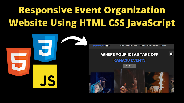
Hello friends, welcome to our new beautiful project today. Today we have created a beautiful project for you which is an Event Organization website. This website is completely responsive, due to which it works on all devices. We have created this website with the help of html, CSS and JavaScript. We have also used some animation in this website, which will make our website look even better. In this website, we have created a function with JavaScript, in which we have added some random colors, with the help of which we can change different colors of the text.
We have created a hero section at the top of the website, in which we have added text and heading and Below that we have added some images which slide and this animation makes our website look good. Then in our website we have created about section and service section and along with this we have also created a gallery section in which we have added some images which the user can share. We have kept the UI of the website dynamic which looks very good. So let's go now let's understand the code step by step.
Related Blog Post:
Learn How to Get Your First Freelance Client
Index.html
- <!DOCTYPE html> This is the most important tag of HTML, from which we come to know that this code is HTML code
- This is the title tag of html through which we can add the title of our project <title>Event Organisers | developergtm</title>
- Friends, we have used some sliders in our website, for which we have used this link tag <link rel="stylesheet" href=".....Link....."/>
- To link the css code file to html we have used this link tag <link rel="stylesheet" href="styles.css" />
- First of all we have created header section <header class="header"> in this we have added logo <a href="#" class="logo"><span>Developer</span>gtm</a>
- We have also added some menu items in Navbar for which we have created a separate section <nav class="navbar">
- Then to create the home section, we have created a section <section class="home" id="home"> and created a content box in it <div class="content"> In this, we have added text or heading
- To create the image slider, we have created a container <div class="sweeper-container home-slider"> and added the images to it
- For the service section we have created a container <section class="service" id="service"> in this we have also added a heading <h1 class="heading">our <span>services</span></h1>
- To create About Us we have created a section <section class="About" id="About"> and in it we have added the heading <h1>
- About that we have also added an image for which we have created an image box <div class="image"> In this we have added our image
- Then friends, the most important thing is our footer section which we have created in this way <section class="footer"> In this, we have created another container <div class="box-container">
- To link the javascript file to html we have used this link tag <script src="app.js"></script>
  <!DOCTYPE html>
<html lang="en">
  <!--Created by developergtm-->
  <head>
    <meta charset="UTF-8" />
    <meta http-equiv="X-UA-Compatible" content="IE=edge" />
    <meta name="viewport" content="width=device-width, initial-scale=1.0" />
    <title>Event Organisers | developergtm</title>

    <!--swiper css-->
    <link
      rel="stylesheet"
      href="https://cdn.jsdelivr.net/npm/swiper@9/swiper-bundle.min.css"
    />

    <!--font awesome-->
    <link
      rel="stylesheet"
      href="https://cdnjs.cloudflare.com/ajax/libs/font-awesome/6.2.1/css/all.min.css"
    />

    <!--css file-->
    <link rel="stylesheet" href="styles.css" />
  </head>
  <body>
    <!-- header section starts  -->
    <header class="header">
      <a href="#" class="logo"><span>Developer</span>gtm</a>

      <nav class="navbar">
        <a href="#home">home</a>
        <a href="#service">service</a>
        <a href="#about">about</a>
        <a href="#gallery">gallery</a>
        <a href="#price">price</a>
        <a href="#review">review</a>
        <a href="#contact">contact</a>
      </nav>

      <div id="menu-bars" class="fas fa-bars"></div>
    </header>

    <!-- home section starts  -->
    <section class="home" id="home">
      <div class="content">
        <h3>
          where your ideas take off
          <span> kanasu events </span>
        </h3>
        <a href="#" class="btn">get quote</a>
      </div>

      <div class="swiper-container home-slider">
        <div class="swiper-wrapper">
          <div class="swiper-slide">
            <img src="images/home1.jpg" alt="" />
          </div>
          <div class="swiper-slide">
            <img src="images/home2.jpg" alt="" />
          </div>
          <div class="swiper-slide">
            <img src="images/home3.jpg" alt="" />
          </div>
          <div class="swiper-slide">
            <img src="images/home4.jpg" alt="" />
          </div>
          <div class="swiper-slide">
            <img src="images/home5.jpg" alt="" />
          </div>
          <div class="swiper-slide">
            <img src="images/home6.jpg" alt="" />
          </div>
        </div>
      </div>
    </section>

    <!-- service section starts  -->
    <section class="service" id="service">
      <h1 class="heading">our <span>services</span></h1>

      <div class="box-container">
        <div class="box">
          <i class="fas fa-envelope"></i>
          <h3>invitation card design</h3>
          <p>
            Lorem ipsum dolor sit, amet consectetur adipisicing elit. Porro,
            suscipit.
          </p>
        </div>

        <div class="box">
          <i class="fas fa-photo-video"></i>
          <h3>photos and videos</h3>
          <p>
            Lorem ipsum dolor sit, amet consectetur adipisicing elit. Porro,
            suscipit.
          </p>
        </div>

        <div class="box">
          <i class="fas fa-music"></i>
          <h3>entertainment</h3>
          <p>
            Lorem ipsum dolor sit, amet consectetur adipisicing elit. Porro,
            suscipit.
          </p>
        </div>

        <div class="box">
          <i class="fas fa-car"></i>
          <h3>enent vehicles</h3>
          <p>
            Lorem ipsum dolor sit, amet consectetur adipisicing elit. Porro,
            suscipit.
          </p>
        </div>

        <div class="box">
          <i class="fas fa-map-marker-alt"></i>
          <h3>venue selection</h3>
          <p>
            Lorem ipsum dolor sit, amet consectetur adipisicing elit. Porro,
            suscipit.
          </p>
        </div>

        <div class="box">
          <i class="fas fa-birthday-cake"></i>
          <h3>food catering</h3>
          <p>
            Lorem ipsum dolor sit, amet consectetur adipisicing elit. Porro,
            suscipit.
          </p>
        </div>
      </div>
    </section>

    <!-- about section starts  -->
    <section class="about" id="about">
      <h1 class="heading"><span>about</span> us</h1>

      <div class="row">
        <div class="image">
          <img src="images/about.jpg" alt="" />
        </div>

        <div class="content">
          <h3>your occasion deserves our careful planning</h3>
          <p>
            Lorem ipsum dolor sit amet consectetur adipisicing elit. Ullam
            labore fugiat ut esse perferendis perspiciatis provident dolores
            fuga in facilis culpa possimus, quia praesentium itaque, sapiente
            quasi harum rem asperiores.
          </p>
          <p>
            Lorem, ipsum dolor sit amet consectetur adipisicing elit. Fugiat
            vero expedita incidunt provident quibusdam aut odit, numquam
            nesciunt similique nisi.
          </p>
          <a href="#" class="btn">reach us</a>
        </div>
      </div>
    </section>

    <!-- gallery section starts  -->
    <section class="gallery" id="gallery">
      <h1 class="heading">our <span>gallery</span></h1>

      <div class="box-container">
        <div class="box">
          <img src="images/gallery1.jpg" alt="" />
          <h3 class="title">best events</h3>
          <div class="icons">
            <a href="#" class="fas fa-heart"></a>
            <a href="#" class="fas fa-share"></a>
            <a href="#" class="fas fa-eye"></a>
          </div>
        </div>

        <div class="box">
          <img src="images/gallery2.jpg" alt="" />
          <h3 class="title">best events</h3>
          <div class="icons">
            <a href="#" class="fas fa-heart"></a>
            <a href="#" class="fas fa-share"></a>
            <a href="#" class="fas fa-eye"></a>
          </div>
        </div>

        <div class="box">
          <img src="images/gallery3.jpg" alt="" />
          <h3 class="title">best events</h3>
          <div class="icons">
            <a href="#" class="fas fa-heart"></a>
            <a href="#" class="fas fa-share"></a>
            <a href="#" class="fas fa-eye"></a>
          </div>
        </div>

        <div class="box">
          <img src="images/gallery4.jpg" alt="" />
          <h3 class="title">best events</h3>
          <div class="icons">
            <a href="#" class="fas fa-heart"></a>
            <a href="#" class="fas fa-share"></a>
            <a href="#" class="fas fa-eye"></a>
          </div>
        </div>

        <div class="box">
          <img src="images/gallery5.jpg" alt="" />
          <h3 class="title">best events</h3>
          <div class="icons">
            <a href="#" class="fas fa-heart"></a>
            <a href="#" class="fas fa-share"></a>
            <a href="#" class="fas fa-eye"></a>
          </div>
        </div>

        <div class="box">
          <img src="images/gallery6.jpg" alt="" />
          <h3 class="title">best events</h3>
          <div class="icons">
            <a href="#" class="fas fa-heart"></a>
            <a href="#" class="fas fa-share"></a>
            <a href="#" class="fas fa-eye"></a>
          </div>
        </div>

        <div class="box">
          <img src="images/gallery7.jpg" alt="" />
          <h3 class="title">best events</h3>
          <div class="icons">
            <a href="#" class="fas fa-heart"></a>
            <a href="#" class="fas fa-share"></a>
            <a href="#" class="fas fa-eye"></a>
          </div>
        </div>

        <div class="box">
          <img src="images/gallery8.jpg" alt="" />
          <h3 class="title">best events</h3>
          <div class="icons">
            <a href="#" class="fas fa-heart"></a>
            <a href="#" class="fas fa-share"></a>
            <a href="#" class="fas fa-eye"></a>
          </div>
        </div>

        <div class="box">
          <img src="images/gallery9.jpg" alt="" />
          <h3 class="title">best events</h3>
          <div class="icons">
            <a href="#" class="fas fa-heart"></a>
            <a href="#" class="fas fa-share"></a>
            <a href="#" class="fas fa-eye"></a>
          </div>
        </div>
      </div>
    </section>

    <!-- price section starts  -->
    <section class="price" id="price">
      <h1 class="heading">our <span>pricing</span></h1>

      <div class="box-container">
        <div class="box">
          <h3 class="title">basic</h3>
          <h3 class="amount">$879.00</h3>
          <ul>
            <li><i class="fas fa-check"></i>full services</li>
            <li><i class="fas fa-check"></i> decorations</li>
            <li><i class="fas fa-check"></i> music and photos</li>
            <li><i class="fas fa-check"></i> food and drinks</li>
            <li><i class="fas fa-check"></i> invitation card</li>
          </ul>
          <a href="#" class="btn">check out</a>
        </div>

        <div class="box">
          <h3 class="title">prime</h3>
          <h3 class="amount">$799.00</h3>
          <ul>
            <li><i class="fas fa-check"></i>full services</li>
            <li><i class="fas fa-check"></i> decorations</li>
            <li><i class="fas fa-check"></i> music and photos</li>
            <li><i class="fas fa-check"></i> food and drinks</li>
            <li><i class="fas fa-check"></i> invitation card</li>
          </ul>
          <a href="#" class="btn">check out</a>
        </div>

        <div class="box">
          <h3 class="title">luxury</h3>
          <h3 class="amount">$379.00</h3>
          <ul>
            <li><i class="fas fa-check"></i>full services</li>
            <li><i class="fas fa-check"></i> decorations</li>
            <li><i class="fas fa-check"></i> music and photos</li>
            <li><i class="fas fa-check"></i> food and drinks</li>
            <li><i class="fas fa-check"></i> invitation card</li>
          </ul>
          <a href="#" class="btn">check out</a>
        </div>

        <div class="box">
          <h3 class="title">ultra</h3>
          <h3 class="amount">$920.00</h3>
          <ul>
            <li><i class="fas fa-check"></i>full services</li>
            <li><i class="fas fa-check"></i> decorations</li>
            <li><i class="fas fa-check"></i> music and photos</li>
            <li><i class="fas fa-check"></i> food and drinks</li>
            <li><i class="fas fa-check"></i> invitation card</li>
          </ul>
          <a href="#" class="btn">check out</a>
        </div>
      </div>
    </section>

    <!-- review section starts  -->
    <section class="reivew" id="review">
      <h1 class="heading">client's <span>review</span></h1>

      <div class="review-slider swiper-container">
        <div class="swiper-wrapper">
          <div class="swiper-slide box">
            <i class="fas fa-quote-right"></i>
            <div class="user">
              <img src="images/img1.jpg" alt="" />
              <div class="user-info">
                <h3>nayana</h3>
                <span>happy customer</span>
              </div>
            </div>
            <p>
              Lorem ipsum dolor sit amet consectetur adipisicing elit. Corporis
              dolor dicta cum. Eos beatae eligendi, magni numquam nemo sed ut
              corrupti, ipsam iure nisi unde et assumenda perspiciatis
              voluptatibus nihil.
            </p>
          </div>

          <div class="swiper-slide box">
            <i class="fas fa-quote-right"></i>
            <div class="user">
              <img src="images/img2.jpg" alt="" />
              <div class="user-info">
                <h3>lisa</h3>
                <span>happy customer</span>
              </div>
            </div>
            <p>
              Lorem ipsum dolor sit amet consectetur adipisicing elit. Corporis
              dolor dicta cum. Eos beatae eligendi, magni numquam nemo sed ut
              corrupti, ipsam iure nisi unde et assumenda perspiciatis
              voluptatibus nihil.
            </p>
          </div>

          <div class="swiper-slide box">
            <i class="fas fa-quote-right"></i>
            <div class="user">
              <img src="images/img3.jpg" alt="" />
              <div class="user-info">
                <h3>mary</h3>
                <span>happy customer</span>
              </div>
            </div>
            <p>
              Lorem ipsum dolor sit amet consectetur adipisicing elit. Corporis
              dolor dicta cum. Eos beatae eligendi, magni numquam nemo sed ut
              corrupti, ipsam iure nisi unde et assumenda perspiciatis
              voluptatibus nihil.
            </p>
          </div>

          <div class="swiper-slide box">
            <i class="fas fa-quote-right"></i>
            <div class="user">
              <img src="images/img4.jpg" alt="" />
              <div class="user-info">
                <h3>rose</h3>
                <span>happy customer</span>
              </div>
            </div>
            <p>
              Lorem ipsum dolor sit amet consectetur adipisicing elit. Corporis
              dolor dicta cum. Eos beatae eligendi, magni numquam nemo sed ut
              corrupti, ipsam iure nisi unde et assumenda perspiciatis
              voluptatibus nihil.
            </p>
          </div>
        </div>
      </div>
    </section>

    <!-- contact section starts  -->
    <section class="contact" id="contact">
      <h1 class="heading"><span>contact</span> us</h1>

      <form action="">
        <div class="inputBox">
          <input type="text" placeholder="name" />
          <input type="email" placeholder="email" />
        </div>
        <div class="inputBox">
          <input type="tel" placeholder="number" />
          <input type="text" placeholder="subject" />
        </div>
        <textarea
          name=""
          placeholder="message"
          id=""
          cols="30"
          rows="10"
        ></textarea>
        <input type="submit" value="send message" class="btn" />
      </form>
    </section>

    <!-- footer section starts  -->
    <section class="footer">
      <div class="box-container">
        <div class="box">
          <h3>branches</h3>
          <a href="#"> <i class="fas fa-map-marker-alt"></i> bangalore </a>
          <a href="#"> <i class="fas fa-map-marker-alt"></i> hyderabad </a>
          <a href="#"> <i class="fas fa-map-marker-alt"></i> delhi </a>
          <a href="#"> <i class="fas fa-map-marker-alt"></i> kolkata </a>
          <a href="#"> <i class="fas fa-map-marker-alt"></i> chennai </a>
        </div>

        <div class="box">
          <h3>quick links</h3>
          <a href="#"> <i class="fas fa-arrow-right"></i> home </a>
          <a href="#"> <i class="fas fa-arrow-right"></i> service </a>
          <a href="#"> <i class="fas fa-arrow-right"></i> about </a>
          <a href="#"> <i class="fas fa-arrow-right"></i> gallery </a>
          <a href="#"> <i class="fas fa-arrow-right"></i> price </a>
          <a href="#"> <i class="fas fa-arrow-right"></i> reivew </a>
          <a href="#"> <i class="fas fa-arrow-right"></i> contact </a>
        </div>

        <div class="box">
          <h3>contact info</h3>
          <a href="#"> <i class="fas fa-phone"></i> +123-456-7890 </a>
          <a href="#"> <i class="fas fa-phone"></i> +123-456-7890 </a>
          <a href="#"> <i class="fas fa-envelope"></i> kanasu@gmail.com </a>
          <a href="#"> <i class="fas fa-envelope"></i> kanasuind@gmail.com </a>
          <a href="#">
            <i class="fas fa-map-marker-alt"></i> bangalore, india - 560054
          </a>
        </div>

        <div class="box">
          <h3>follow us</h3>
          <a href="#"> <i class="fab fa-facebook-f"></i> facebook </a>
          <a href="#"> <i class="fab fa-twitter"></i> twitter </a>
          <a href="#"> <i class="fab fa-instagram"></i> instagram </a>
          <a href="#"> <i class="fab fa-linkedin-in"></i> linkedin </a>
        </div>
      </div>

      <div class="credit">
        created by <span>developergtm</span> | all rights reserved
      </div>
    </section>

    <!-- theme toggler  -->
    <div class="theme-toggler">
      <div class="toggle-btn">
        <i class="fas fa-cog"></i>
      </div>

      <h3>choose color</h3>

      <div class="buttons">
        <div class="theme-btn" style="background: #ccff33"></div>
        <div class="theme-btn" style="background: #d35400"></div>
        <div class="theme-btn" style="background: #f39c12"></div>
        <div class="theme-btn" style="background: #1abc9c"></div>
        <div class="theme-btn" style="background: #3498db"></div>
        <div class="theme-btn" style="background: #9b59b6"></div>
      </div>
    </div>

    <!-- Swiper JS -->
    <script src="https://cdn.jsdelivr.net/npm/swiper@9/swiper-bundle.min.js"></script>

    <!--JS file-->
    <script src="app.js"></script>
  </body>
</html>
Style.css
Now we are going to save the code of CSS that how we have designed our website, so let us now save the code of CSS.
- First of all we have added the font font-family: "Poppins", sans-serif; or box-sizing: border-box; so that the width and height of our content is set
- We have used this color in the website background background: #222;
- In the navbar we have used this background color background: #333; and display flex, due to which we have align-items: center; and along with this we have justified-content: space-between;
- To design the logo, we have used font-weight: bolder; color is white and font size is 2.5 rems
- In home section we have centered the text text-align: center; padding 6rem from top and we have added margin to it margin: 2rem auto;
- In service section we have used grid display: grid; and in this we have kept gap: 1.5rem;
- In service section we have created some boxes in which we have placed border-radius: 0.5rem; and centered the text in it and in background we have used this color background: #333;
- We have also added some icons in the service box, in which we have kept height: 6rem; and kept the width same
- In about section we have kept display flex and centered the text and in this we have added gap: 1.5rem;
- In this we have also added an image whose width is kept 100% and in this we have border-radius: 0.5rem;
- To make our website responsive we have used media query which is something like this @media (max-width: 768ps)
- In the contact form we have added max width max-width: 70rem; and centered the text
:root {
  --theme-color: #3867d6;
}

* {
  font-family: "Poppins", sans-serif;
  margin: 0;
  padding: 0;
  box-sizing: border-box;
  outline: none;
  border: none;
  text-decoration: none;
  text-transform: capitalize;
  transition: 0.2s linear;
}

html {
  font-size: 62.5%;
  overflow-x: hidden;
  scroll-padding-top: 7rem;
  scroll-behavior: smooth;
}

body {
  background: #222;
}

section {
  padding: 2rem 9%;
}

.header {
  position: fixed;
  top: 0;
  left: 0;
  right: 0;
  z-index: 10000;
  background: #333;
  display: flex;
  align-items: center;
  justify-content: space-between;
  padding: 1.5rem 9%;
}

.header .logo {
  font-weight: bolder;
  color: #fff;
  font-size: 2.5rem;
}

.header .logo span {
  color: var(--theme-color);
}

.header .navbar a {
  font-size: 1.7rem;
  color: #fff;
  margin-left: 2rem;
}

.header .navbar a:hover {
  color: var(--theme-color);
}

#menu-bars {
  font-size: 3rem;
  color: #fff;
  cursor: pointer;
  display: none;
}

.home .content {
  text-align: center;
  padding-top: 6rem;
  margin: 2rem auto;
  max-width: 70rem;
}

.home .content h3 {
  color: #fff;
  font-size: 4.5rem;
  text-transform: uppercase;
}

.home .content h3 span {
  color: var(--theme-color);
  text-transform: uppercase;
}


.btn {
  margin-top: 1rem;
  display: inline-block;
  padding: 0.8rem 3rem;
  font-size: 1.7rem;
  border-radius: 0.5rem;
  background: #666;
  color: #fff;
  cursor: pointer;
  font-weight: 600;
}

.btn:hover {
  background: var(--theme-color);
}

.home .home-slider .swiper-slide {
  overflow: hidden;
  border-radius: 0.5rem;
  height: 50rem;
  width: 35rem;
}

.home .home-slider .swiper-slide img {
  height: 100%;
  width: 100%;
  object-fit: cover;
}

.heading {
  text-align: center;
  padding-bottom: 2rem;
  color: #fff;
  text-transform: uppercase;
  font-size: 4rem;
}

.heading span {
  color: var(--theme-color);
  text-transform: uppercase;
}

.service .box-container {
  display: grid;
  grid-template-columns: repeat(auto-fit, minmax(27rem, 1fr));
  gap: 1.5rem;
}

.service .box-container .box {
  border-radius: 0.5rem;
  background: #333;
  text-align: center;
  padding: 2.5rem;
}

.service .box-container .box i {
  height: 6rem;
  width: 6rem;
  line-height: 6rem;
  border-radius: 50%;
  font-size: 2.5rem;
  background: var(--theme-color);
  color: #fff;
}

.service .box-container .box h3 {
  font-size: 2rem;
  color: #fff;
  padding: 1rem 0;
}

.service .box-container .box p {
  font-size: 1.4rem;
  color: #eee;
  line-height: 1.8;
}

.about .row {
  display: flex;
  align-items: center;
  flex-wrap: wrap;
  gap: 1.5rem;
}

.about .row .image {
  flex: 1 1 45rem;
  padding: 1rem;
}

.about .row .image img {
  width: 100%;
  border-radius: 0.5rem;
  border: 1rem solid #333;
}

.about .row .content {
  flex: 1 1 45rem;
}

.about .row .content h3 {
  font-size: 3.5rem;
  color: #fff;
}

.about .row .content p {
  font-size: 1.5rem;
  color: #eee;
  padding: 1rem 0;
  line-height: 2;
}

.gallery .box-container {
  display: grid;
  grid-template-columns: repeat(auto-fit, minmax(27rem, 1fr));
  gap: 1.5rem;
}

.gallery .box-container .box {
  position: relative;
  border: 1rem solid #333;
  border-radius: 0.5rem;
  height: 25rem;
  cursor: pointer;
  overflow: hidden;
}

.gallery .box-container .box img {
  height: 100%;
  width: 100%;
  object-fit: cover;
}

.gallery .box-container .box:hover img {
  transform: scale(1.1);
  filter: grayscale();
}

.gallery .box-container .box .title {
  position: absolute;
  top: -10rem;
  left: 0;
  right: 0;
  background: #333;
  color: #fff;
  text-align: center;
  padding-bottom: 1rem;
  font-size: 2rem;
}

.gallery .box-container .box:hover .title {
  top: 0;
}

.gallery .box-container .box .icons {
  position: absolute;
  bottom: -10rem;
  left: 0;
  right: 0;
  background: #333;
  padding-top: 1rem;
  text-align: center;
}

.gallery .box-container .box:hover .icons {
  bottom: 0;
}

.gallery .box-container .box .icons a {
  font-size: 2rem;
  margin: 0.5rem 1rem;
  color: #fff;
}

.gallery .box-container .box .icons a:hover {
  color: var(--theme-color);
}

.price .box-container {
  display: grid;
  grid-template-columns: repeat(auto-fit, minmax(25rem, 1fr));
  gap: 1.5rem;
}

.price .box-container .box {
  padding: 2rem 0;
  background: #333;
  border-radius: 0.5rem;
  text-align: center;
}

.price .box-container .box:hover {
  transform: scale(1.03);
}

.price .box-container .box .title {
  background: var(--theme-color);
  color: #fff;
  padding: 1.5rem 0;
  font-size: 2rem;
}

.price .box-container .box .amount {
  color: #fff;
  padding-top: 2rem;
  font-size: 4rem;
}

.price .box-container .box ul {
  list-style-type: none;
  padding: 1rem 0;
}

.price .box-container .box ul li {
  font-size: 1.5rem;
  color: #eee;
  padding: 1rem 0;
}

.price .box-container .box ul li i {
  color: var(--theme-color);
  padding-right: 0.5rem;
}

.reivew .box {
  border-radius: 0.5rem;
  background: #333;
  padding: 2rem;
  position: relative;
}

.reivew .box .fa-quote-right {
  position: absolute;
  top: 2rem;
  right: 2rem;
  color: var(--theme-color);
  font-size: 5rem;
}

.reivew .box .user {
  display: flex;
  align-items: center;
  gap: 1.5rem;
  padding-bottom: 1rem;
}

.reivew .box .user img {
  height: 7rem;
  width: 7rem;
  border-radius: 50%;
  object-fit: cover;
}

.reivew .box .user h3 {
  font-size: 2rem;
  color: #fff;
}

.reivew .box .user span {
  font-size: 1.5rem;
  color: #eee;
}

.reivew .box p {
  line-height: 2;
  color: #eee;
  padding: 0.5rem 0;
  font-size: 1.6rem;
}

.contact form {
  max-width: 70rem;
  margin: 1rem auto;
  text-align: center;
}

.contact form .inputBox {
  display: flex;
  justify-content: space-between;
  flex-wrap: wrap;
}

.contact form .inputBox input,
.contact form textarea {
  width: 100%;
  background: #333;
  border-radius: 0.5rem;
  padding: 1rem;
  margin: 0.7rem 0;
  font-size: 1.5rem;
  color: #fff;
  text-transform: none;
}

.contact form .inputBox input::placeholder,
.contact form textarea::placeholder {
  color: #eee;
  text-transform: capitalize;
}

.contact form .inputBox input:focus,
.contact form textarea:focus {
  background: #444;
}

.contact form .inputBox input {
  width: 49%;
}

.contact form textarea {
  resize: none;
}

.footer {
  background: #111;
}

.footer .box-container {
  display: grid;
  grid-template-columns: repeat(auto-fit, minmax(25rem, 1fr));
  gap: 1.5rem;
}

.footer .box-container .box h3 {
  font-size: 2.5rem;
  padding: 1rem 0;
  color: #fff;
}

.footer .box-container .box a {
  display: block;
  font-size: 1.5rem;
  padding: 1rem 0;
  color: #eee;
}

.footer .box-container .box a i {
  padding-right: 0.5rem;
  color: var(--theme-color);
}

.footer .box-container .box a:hover i {
  padding-right: 1.5rem;
  color: #fff;
}

.footer .credit {
  text-align: center;
  border-top: 0.1rem solid #222;
  color: #fff;
  padding: 2rem;
  padding-top: 2.5rem;
  margin-top: 1rem;
  font-size: 2rem;
}

.footer .credit span {
  color: var(--theme-color);
}

html::-webkit-scrollbar {
  width: 1rem;
}

html::-webkit-scrollbar-track {
  background: #444;
}

html::-webkit-scrollbar-thumb {
  background: var(--theme-color);
  border-radius: 5rem;
}


.theme-toggler {
  position: fixed;
  top: 10rem;
  right: -20rem;
  background: #333;
  z-index: 1000;
  width: 20rem;
  text-align: center;
}

.theme-toggler.active {
  right: 0;
}

.theme-toggler h3 {
  color: #fff;
  padding: 1rem 0;
  font-size: 2rem;
}

.theme-toggler .buttons {
  display: flex;
  justify-content: center;
  flex-wrap: wrap;
  gap: 1rem;
  padding: 1rem;
}

.theme-toggler .buttons .theme-btn {
  height: 5rem;
  width: 5rem;
  border-radius: 50%;
  cursor: pointer;
}

.theme-toggler .toggle-btn {
  position: absolute;
  top: 0;
  left: -5.9rem;
  padding: 1.3rem 1.5rem;
  background: #333;
  cursor: pointer;
}

.theme-toggler .toggle-btn i {
  color: #fff;
  font-size: 3rem;
  animation: spin 4s linear infinite;
}

@keyframes spin {
  0% {
    transform: rotate(360deg);
  }
}

/* media queries  */

@media (max-width: 991px) {
  html {
    font-size: 55%;
  }

  .header {
    padding: 1.5rem 2rem;
  }

  section {
    padding: 2rem;
  }
}

@media (max-width: 768px) {
  #menu-bars {
    display: initial;
  }

  .header .navbar {
    position: absolute;
    top: 100%;
    left: 0;
    right: 0;
    border-top: 0.1rem solid #222;
    background: #333;
    clip-path: polygon(0 0, 100% 0, 100% 0, 0 0);
  }

  .header .navbar.active {
    clip-path: polygon(0 0, 100% 0, 100% 100%, 0% 100%);
  }

  .fa-times {
    transform: rotate(180deg);
  }

  .header .navbar a {
    display: flex;
    background: #222;
    border-radius: 0.5rem;
    padding: 1.3rem;
    margin: 1.3rem;
    font-size: 2rem;
  }

  .home .content h3 {
    font-size: 4rem;
  }
}

@media (max-width: 450px) {
  html {
    font-size: 50%;
  }

  .home .home-slider .swiper-slide {
    width: 27rem;
  }

  .contact form .inputBox input {
    width: 100%;
  }
}
Script.js
- First we have added the navbar in JavaScript for which we have added a querySelector let menu = document.querySelector("#menu-bars");
- Just like we added menu bar in JavaScript, we have added our navbar also with queryselector
- We have set menu.onclick as menu item of the number so that the menu item will be displayed only when the user clicks on the button
- We have created a button in the website through which we can change the theme of our website. let themeToggler = document.querySelector(".theme-toggler");
- Then we have written the JavaScript code to add the slider like this var sweeper = new Sweeper(".home-slider",
let menu = document.querySelector("#menu-bars");
let navbar = document.querySelector(".navbar");

menu.onclick = () => {
  menu.classList.toggle("fa-times");
  navbar.classList.toggle("active");
};

let themeToggler = document.querySelector(".theme-toggler");
let toggleBtn = document.querySelector(".toggle-btn");

toggleBtn.onclick = () => {
  themeToggler.classList.toggle("active");
};

window.onscroll = () => {
  menu.classList.remove("fa-times");
  navbar.classList.remove("active");
  themeToggler.classList.remove("active");
};

document.querySelectorAll(".theme-toggler .theme-btn").forEach((btn) => {
  btn.onclick = () => {
    let color = btn.style.background;
    document.querySelector(":root").style.setProperty("--theme-color", color);
  };
});

var swiper = new Swiper(".home-slider", {
  effect: "coverflow",
  grabCursor: true,
  centeredSlides: true,
  slidesPerView: "auto",
  coverflowEffect: {
    rotate: 0,
    stretch: 0,
    depth: 100,
    modifier: 2,
    slideShadows: true,
  },
  loop: true,
  autoplay: {
    delay: 3000,
    disableOnInteraction: false,
  },
});

var swiper = new Swiper(".review-slider", {
  slidesPerView: 1,
  grabCursor: true,
  loop: true,
  spaceBetween: 10,
  breakpoints: {
    0: {
      slidesPerView: 1,
    },
    700: {
      slidesPerView: 2,
    },
    1050: {
      slidesPerView: 3,
    },
  },
  autoplay: {
    delay: 5000,
    disableOnInteraction: false,
  },
});
No comments:
Post a Comment